Design Process
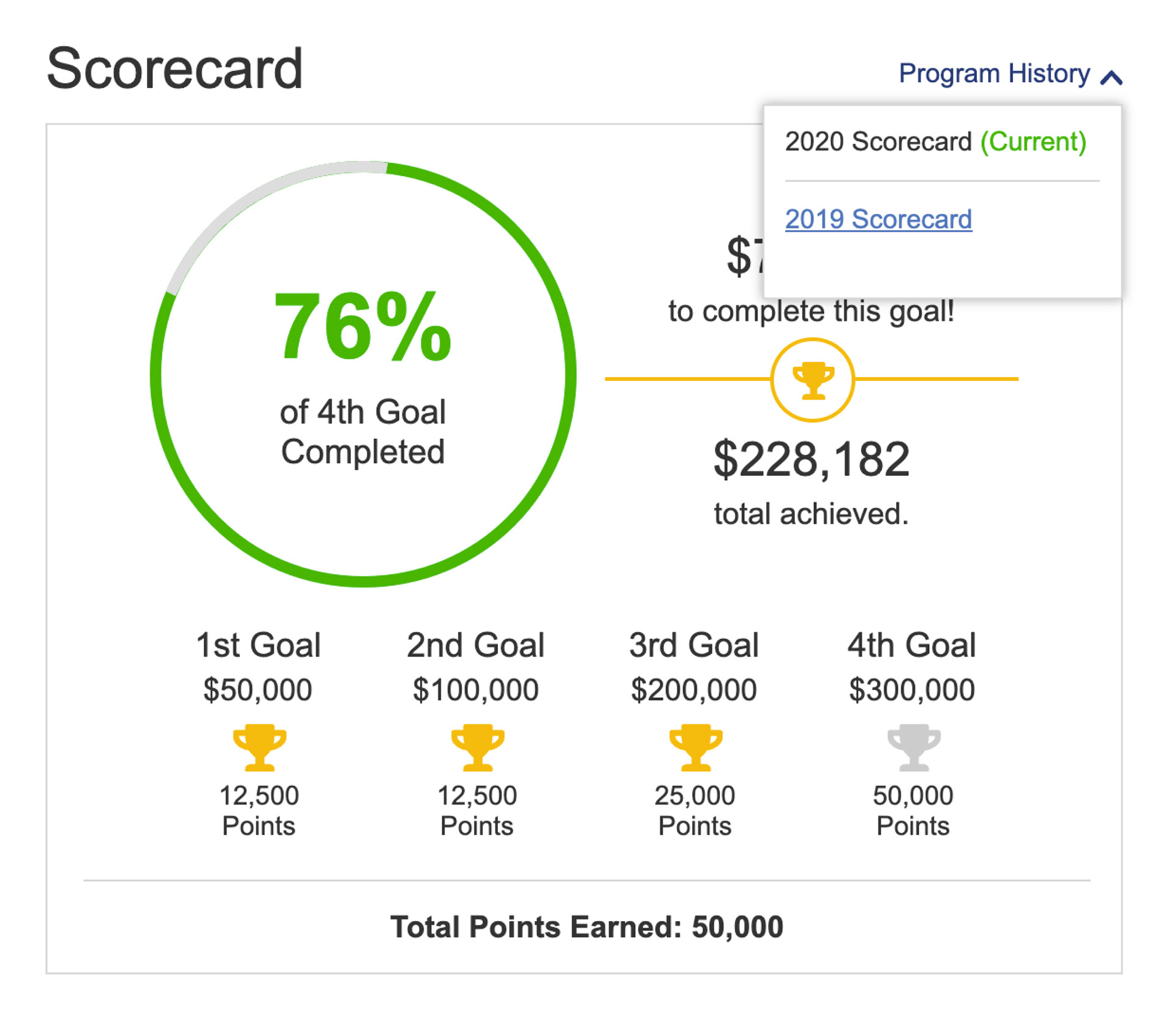
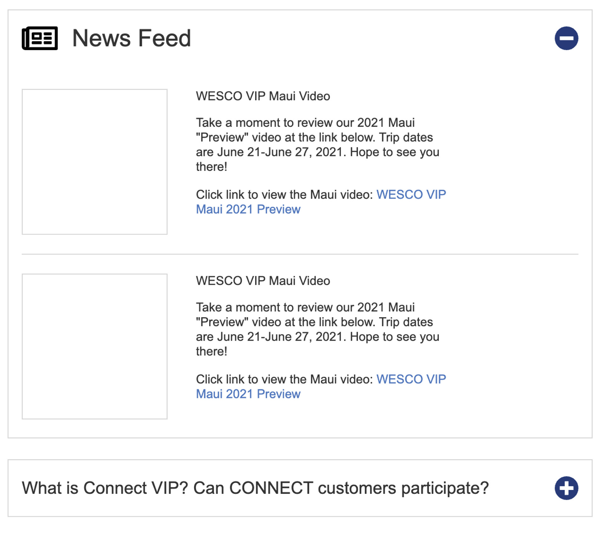
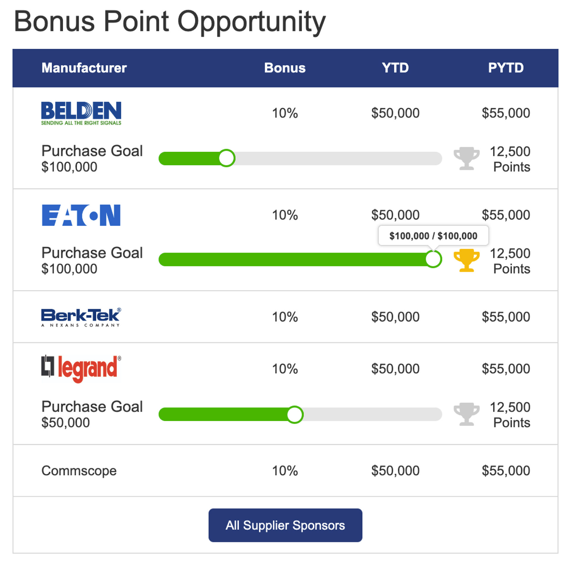
We began this redesign by evaluating both reward programs' current UI / UX with the project team. This project's primary challenge was that the previous versions of the rewards programs had no analytics hooked in, so we didn't have data to help inform design decisions. We had to rely on the project team's input from the sales reps and business partners to help shape the design decisions. Something we made sure got put into this new design was analytics tracking so we could evaluate and revisit for future design enhancements. With the team's insight and notes from sales reps, we began brainstorming on design concepts while incorporating the requests outlined in the business requirements. Once we had low-fidelity wireframe and user flows defined, I designed a new clean and easy-to-use user interface that focused on incorporating gamification to make the visuals of tracking progress a fun user experience.


