SDS Design System: Shared CSS foundations, from production to Figma.
I led our front-end team in building SDS, an internal, utility-first CSS design system. We use its color, typography, and layout utilities daily in production. I’m now mapping those foundations into Figma so design and code can work from the same values.
Project Overview
- My role
- Design system lead
- Team
- Front-end team
- What I led
- I led the team in developing the CSS system and took on mapping its foundations into shared Figma libraries.
- Status
- CSS utilities are deployed and used daily. Figma foundations are in use as the mapping expands.
Why We Built SDS
Make recurring UI decisions reusable
Color, typography, and layout come up on nearly every page. We wanted a shared way to apply those decisions across projects while keeping control of the styles our team relies on.
Build a focused set of utilities
Tailwind’s small, composable classes gave us a model for how to apply shared styles directly in the markup. We built the utilities around the styling needs we already had and kept their names and values under our team’s control.
In Production
SDS is deployed to our front end. The team uses its color, typography, and layout classes daily, applying shared styles as we build pages and UI across projects.
Color
Apply palette values through text, background, and border classes.
Typography
Reuse text sizing, weight, and line-height choices.
Layout
Use custom CSS Grid and Flexbox classes to arrange page sections and their contents.
Mapping SDS into Figma
I started with the CSS already in use. In Figma, color variables use the same utility names as the CSS, and text styles document which classes reproduce them.
Choosing colors with enough contrast
I built contrast maps in Figma so designers can pick text and background colors that meet the WCAG AA contrast minimum for normal text. In the primary palette, white text on shade 500 has a contrast ratio of 5.5:1.
Spacing, shape, and depth
Figma variables carry over the padding, gaps, and corner radii we use in CSS. Shared shadow styles help designers show which surfaces sit above others.
From values to component behavior
The Figma button reference shows how the foundations can support a component. Its state matrix puts default, hover, focus, pressed, and disabled treatments side by side, so designers and developers can compare the choices for each action.
What’s Next
The next step is to use the mapped variables to build a Figma layout and component library around patterns we’ve already built in code. I want a closer one-to-one match, so a designer can choose a layout in Figma and a developer can find its counterpart in production.
- Choose layout patterns already used on the front end.
- Rebuild them as Figma components using the shared foundations.
- Compare each Figma pattern with its CSS counterpart and document how they map.
Read more of my case studies
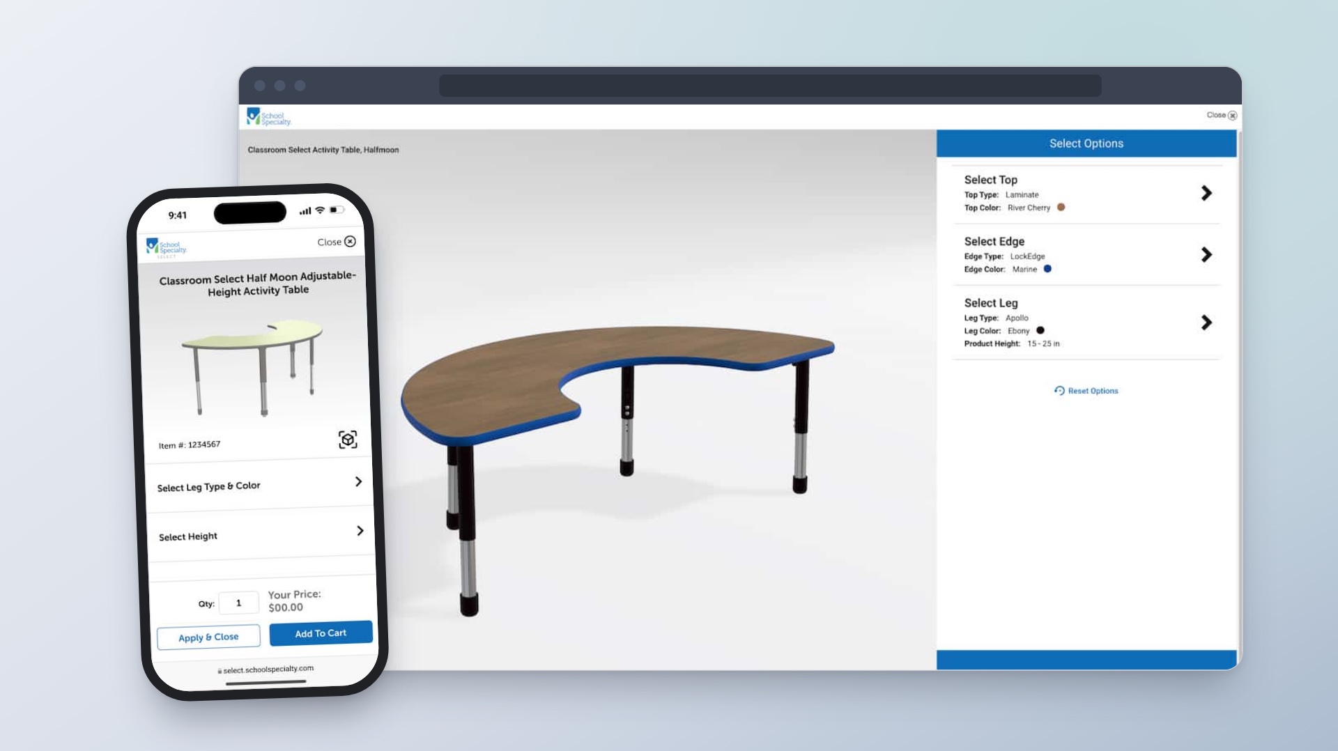
Enterprise Product Configuration Platform
Helping customers choose classroom furniture and see how each option changes the design and price.

Manufacturers Directory
Helping customers find manufacturers, see what they offer, and explore their products.

Services & Solutions
Helping customers find the right service and see what to do next.